
How to Create Better App Store Screenshots in 2026
Written by Jim Raptis
Aug 12, 2026

When someone finds your app in the App Store, every part of the product page helps them decide whether to download it. Your icon earns attention, your title sets expectations, and your screenshots show what the app can actually do.
Screenshots are especially important because people scan store listings quickly. A 2017 study by AppAgent found that visitors spent an average of seven seconds on a listing and focused heavily on the first screenshots. The App Store has changed since that study, but the practical lesson still holds: your opening images need to communicate the app's value without asking people to stop and decode them.
Good App Store screenshots do more than show your interface. They explain the app's strongest benefits, help people imagine using it, and create a visual story that is easy to understand at thumbnail size.
In this guide, we will cover the current App Store screenshot requirements, what makes a screenshot effective, and how to build a complete screenshot set with BrandBird.

What Are the App Store Screenshot Requirements in 2026?
Apple's requirements are straightforward, but a rejected or incorrectly sized asset can slow down your release. Check the official screenshot specifications before every major launch because supported devices and dimensions can change.
Here are the main rules to remember.
1. Show the App in Use
Apple's App Review Guideline 2.3.3 says screenshots should show the app in use, not only title art, a login screen, or a splash screen.
You can add text and image overlays to explain the experience. That means captions, backgrounds, device frames, arrows, and callouts are acceptable as long as the screenshots accurately represent your app and do not make misleading claims.
Use fictional account details instead of real personal data, and make sure you have permission to use every image, logo, review, or other asset that appears in the design.
2. Upload Between 1 and 10 Screenshots
You can upload from one to ten screenshots in each supported localization. You do not need to fill all ten slots simply because they are available.

Use enough screenshots to explain the product without repeating yourself. For a focused app, five strong screenshots may be more persuasive than ten images that say the same thing. Put your clearest benefits first because many people will never reach the end of the gallery.
3. Export JPEG or PNG Files Without Transparency
Apple accepts .jpeg, .jpg, and .png screenshots. Images cannot include alpha channels or transparent areas.
PNG is a practical choice for app interfaces because it keeps text and UI details crisp. Always inspect the exported files at their final dimensions before uploading them to App Store Connect.
4. Use a Supported Size and Orientation
Screenshot dimensions depend on the platform and device display. Apple publishes separate specifications for iPhone, iPad, Mac, Apple TV, Apple Vision Pro, and Apple Watch.

Portrait and landscape assets are supported for many device types, but the accepted dimensions differ. Use Apple's current specification table rather than copying dimensions from an old article or design file.
Apple has also simplified submission for apps that share the same interface across device sizes. According to App Store Connect Help, you can provide only the highest-resolution screenshots required when the UI is the same, and App Store Connect will scale them down for smaller sizes. You can still upload device-specific assets through Media Manager when a layout needs its own composition.
What Makes a Good App Store Screenshot?
A good App Store screenshot makes one useful point quickly. It combines an authentic view of the product with a short benefit, readable typography, and a visual style that feels consistent with the app.
Before designing, decide what each image needs to communicate. If two screenshots have the same purpose, combine them or remove one.
See the examples below of some quality App Store Screenshots 👇

And here is an article to get you started with taking quality screenshots: How To Create Beautiful Screenshots
Now that you got an idea, let’s see some points in more detail!
1. Lead With the Strongest Benefits
Your first screenshots should answer the questions a new visitor is most likely to have:
- What does this app help me do?
- Who is it for?
- What makes it different from the alternatives?
- What will I see after installing it?
Lead with outcomes rather than menu labels. "Plan your week in minutes" gives the reader more context than "Calendar view." Use the interface underneath the caption to prove the claim.
Think of the first three screenshots as a connected sequence:
- The core promise: Show the primary result the app delivers.
- The differentiator: Explain why the experience is useful or distinct.
- The proof: Show a feature or workflow that makes the promise believable.
The remaining screenshots can cover secondary features, integrations, customization, trust signals, or use cases.
2. Keep Every Screenshot Focused
A screenshot should have one main message. Too many captions, badges, arrows, and interface details make the image harder to understand on a phone.

Use a short headline and, only when needed, one supporting line. Crop or scale the app interface so the relevant feature remains visible. If an annotation does not help someone understand the product, remove it.
3. Make Text Readable at Thumbnail Size
People should not need to open the full-screen gallery to understand your captions.

Use large type, strong contrast, and enough empty space around the message. Avoid placing text over a busy part of the interface. Preview the completed set at roughly the size it will appear in App Store search and on the product page.
A practical test is to step back from your screen or zoom the design out. If the headline disappears before the screenshot does, the text is too small or too complex.
4. Show Real Product Value
Apple requires screenshots to reflect the app's core experience accurately. Avoid using abstract artwork as a substitute for the product.
Show recognizable screens and realistic workflows. Enlarge an important UI area when necessary, but keep enough context for the viewer to understand where it belongs. Captions and callouts should clarify the interface rather than cover it.
5. Keep the Set On Brand
Use the same color palette, typography, illustration style, device frames, and spacing throughout the screenshot set. Consistency makes the listing feel intentional and helps people recognize your app across markets and campaigns.
That does not mean every image needs the same composition. Vary the layout to keep the sequence interesting while preserving the visual system.
6. Connect Features to Everyday Use
Features become more persuasive when people understand why they matter.
Instead of writing "Advanced filters," show how filters help someone find the right result faster. Instead of "Team sharing," demonstrate the moment a teammate reviews or approves the work.
Use cases help visitors picture the app in their own routine. Keep those scenarios specific to the audience rather than relying on generic claims such as "Be more productive."
7. Use Social Proof Carefully
A short rating, award, or customer quote can add credibility, but only when it is accurate, current, and relevant. Secure permission before publishing a person's name, photo, company, or testimonial.

Do not let social proof replace the product. The screenshot should still show the app experience and explain the benefit behind the quote.
How to Plan Your Screenshot Story
Before opening an editor, write a one-line goal for every screenshot. This prevents the set from becoming a random collection of features.
A simple seven-image sequence could look like this:
- Core outcome
- Main workflow
- Strongest differentiator
- Secondary use case
- Customization or control
- Collaboration, privacy, or trust
- Final reason to try the app
Review the sequence as one story. The captions should make sense together, but every screenshot should also work on its own.
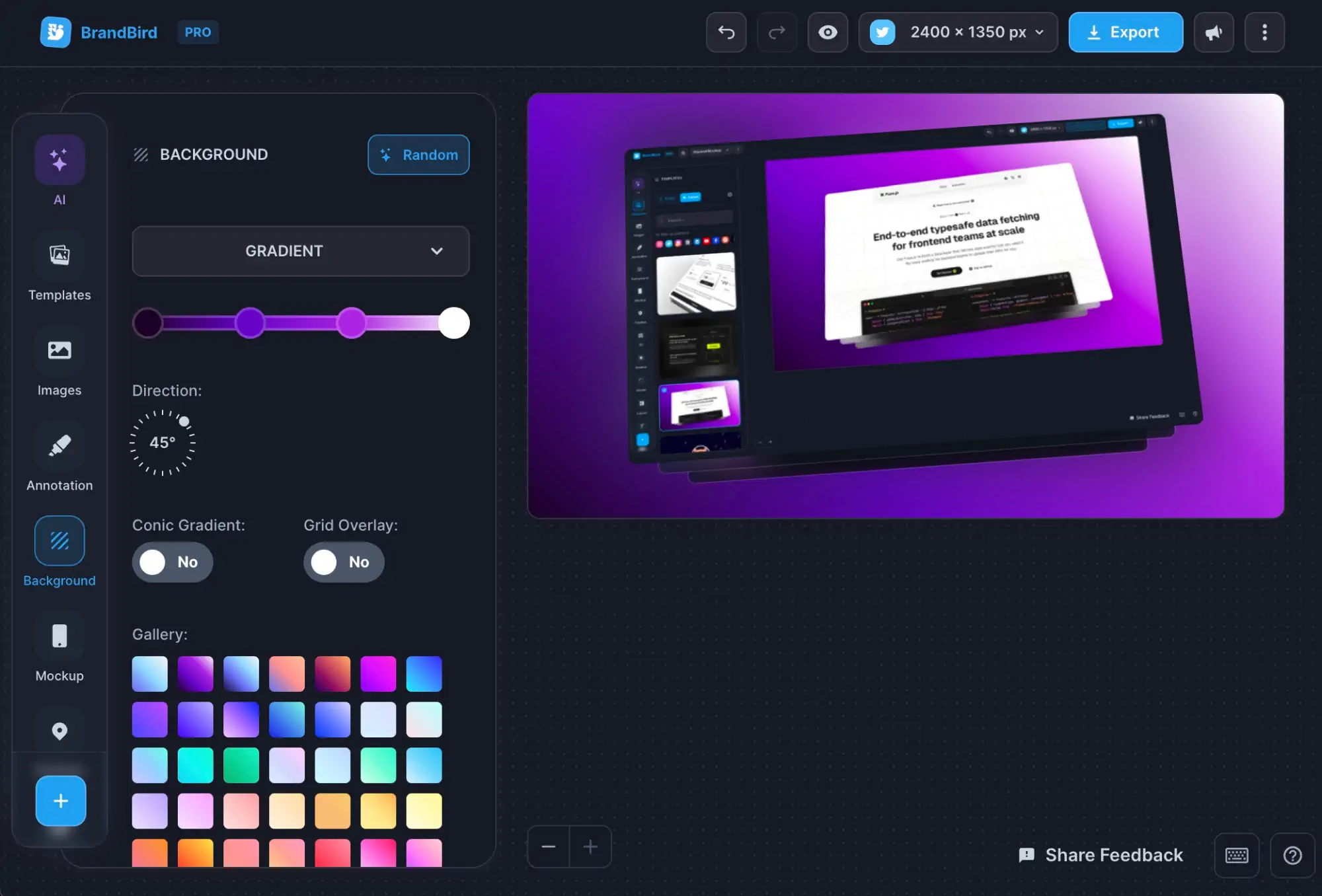
How to Create Quality App Store Screenshots With BrandBird
BrandBird's dedicated App Store Screenshot Generator brings Apple sizes, device mockups, captions, backgrounds, localization, and export into one workflow.
Start With an App Store Template
Choose a design from the App Store screenshot template gallery. Templates give you a consistent layout across multiple screenshots while leaving the copy, colors, mockups, and product images editable.
Pick a template that matches the amount of UI you need to show. A layout built around one large phone works well for detailed interfaces, while multi-device compositions can help explain connected experiences.
Import and Arrange Your App Screens

Add the real product screenshots you want to feature. Start with the screens that support your first three messages, then arrange the rest around the story you planned.
Use the recommended device frame for the selected size, or keep the interface frame-free when that makes the product easier to inspect.
Add Captions and Annotations

Write a short title and optional subtitle for each screenshot. You can add arrows, labels, shapes, images, and App Store award badges to direct attention to an important part of the UI.
BrandBird Pro can also analyze imported screenshots and generate title and subtitle ideas with AI. Treat those suggestions as a first draft: review the wording, confirm every claim, and adapt it to your brand voice.
Apply Your Brand

Set your background colors, gradients, fonts, logo, and supporting graphics. Keep the styling consistent across the entire set so people experience one visual story rather than ten separate advertisements.
Decorative elements should support the interface, not compete with it. Preview every design at a small size before moving on.
Adapt the Design for Apple Devices

Switch between supported presets for iPhone, iPad, Mac, Apple TV, and Apple Watch. Adjust the composition when a device uses a different aspect ratio or interface instead of assuming one layout will work everywhere.
If the same UI and highest-resolution screenshot can be scaled down by App Store Connect, you may not need to create every smaller variant manually. Build separate assets when a specific device deserves a better crop, different screenshot, or tailored message.
Localize the Screenshot Set

A translated App Store description does not help much when the screenshots still contain English captions.
With BrandBird Pro, you can add languages, translate captions with AI, edit the localized wording, replace app screenshots for individual markets, and export the selected language sets while preserving the base design.
Export and Review

Preview your screenshots on a realistic App Store listing within BrandBird. Export the finished PNG files and inspect every image before uploading it to App Store Connect.
Check that:
- Captions are readable at thumbnail size.
- The interface matches the app's current version.
- No personal or confidential data appears.
- Images have no transparency.
- Every localization contains the correct language and screenshots.
- Device-specific assets use accepted dimensions.
App Store Screenshot Checklist
Before publishing, confirm the following:
Frequently Asked Questions

How many App Store screenshots should I use?
Apple allows between one and ten screenshots. Use enough images to explain the app's important benefits without repeating the same message. Prioritize the first two or three because they receive the most immediate attention.
Can I add text and graphics to App Store screenshots?
Yes. Apple allows text and image overlays, and captions can make a feature easier to understand. The underlying screenshot should still show the app in use and accurately represent the product.
Do I need screenshots for every iPhone size?
Not always. Apple says that when the interface is the same across device sizes, you can provide the highest-resolution required screenshots and let App Store Connect scale them down. Upload device-specific assets when the UI or composition needs to differ.
Should App Store screenshots use device frames?
Device frames are optional. They can provide context and make a listing feel polished, but a frame-free screenshot may show more interface detail. Choose the approach that makes the product easiest to understand.
Can AI create my App Store screenshots?
BrandBird uses AI to suggest title and subtitle copy for imported app screenshots. It does not invent your app interface or replace authentic product images. You remain responsible for reviewing the copy and ensuring the listing accurately represents the app.
Should I localize App Store screenshots?
Localize screenshots when they contain captions, text inside the app interface, currencies, dates, units, testimonials, or market-specific imagery. A localized set is easier to understand and creates a more consistent experience with the translated product page.
Create Your App Store Screenshots Now
A strong screenshot set does not need to be complicated. Start with a clear story, show the real product, make every caption readable, and adapt the design for the devices and markets you support.
Create App Store screenshots with BrandBird, or browse the App Store screenshot templates for a faster starting point.
I don't know when it happened but Brandbird is now my all-in-one SaaS & social media design tool.
Founder Senja.io
.jpg?table=block&id=0ba39ebe-d97b-4f97-ab3f-516bd4e190e4&cache=v2)
